Introduction
If you’re looking to dive into Dynamics and start creating those snazzy dashboards, here’s the lowdown: You’ll need two things in your toolkit. First up, you gotta have Office 365, and secondly, you’ll need a license for Dynamics 365. These two buddies are your golden tickets to enter the dashboard world. With them, you’ll be able to whip up some fantastic standard dashboards.
Now, here’s the inside scoop: if you’re aiming for those super interactive dashboards, you might need a little something extra. You’ll want some added system access, like what a System Administrator would have. The licenses for Office 365 and Dynamics are the same deal, no difference there. It’s all about those system permissions when it comes to the fancy interactive stuff. Happy dashboarding, folks! 🚀
Understanding the Basics
Dashboards in Microsoft Dynamics 365 serve as visual displays of the most critical information needed to achieve one or more objectives, consolidated and arranged on a single screen. They give an immediate overview of key metrics and performance indicators, allowing users to make informed decisions swiftly. They are essential for various roles within an organisation, providing immediate insights and enabling quick action.
Standard Dashboards
Definition and Features
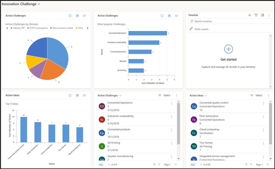
Standard Dashboards are the original dashboard type in Microsoft Dynamics 365. They are configurable and allow users to present data in several formats, such as charts and lists. Standard Dashboards are static, meaning the data they display is refreshed at regular intervals and doesn’t offer real-time interaction.
Pros and Cons
Pros: They are simple, easy to configure, and meet the basic requirements of data visualisation for users who don’t need highly interactive features. They are suitable for users who prefer a straightforward and uncluttered presentation of data.
Cons: The static nature and lack of real-time interaction may not meet the needs of users who require immediate insights and the ability to drill down into more detailed information.

Now, Interactive Dashboards
Definition and Features
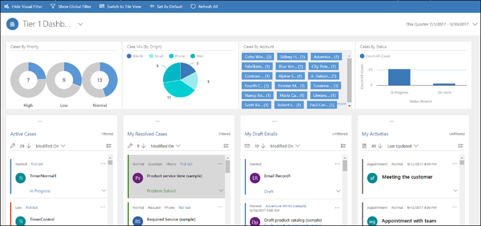
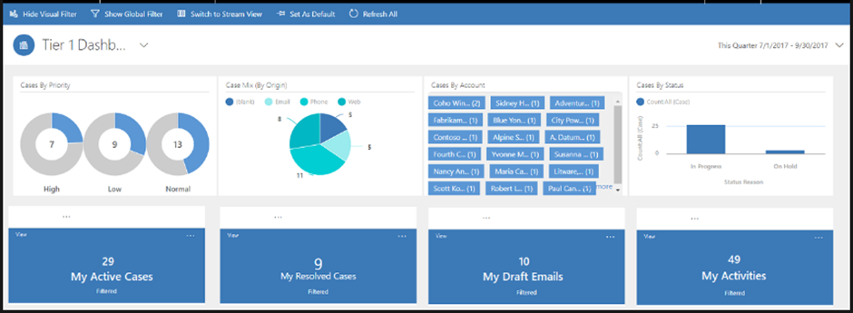
Interactive Dashboards, on the other hand, allow users to interact with data in real time. They provide capabilities for advanced filtering, drilling down into specific data points for more detail, and toggling between different views and entities. These dashboards are dynamic, offering a more comprehensive and immersive experience.
Pros and Cons
Pros: The enriched interactivity enables users to explore data more thoroughly and gain deeper insights, making them suitable for users who need to analyse data extensively. They provide a more holistic view of data, allowing for detailed analyses and refined decision-making processes.
Cons: They can be more complex to configure, and the wealth of information and interactivity might be overwhelming for users who need simpler, more straightforward data presentations.


Use Case Scenarios
Standard Dashboard: Suitable for users who need quick, at-a-glance insights without the need for detailed analysis. For example, a Sales Manager who wants to monitor the team’s overall performance can benefit from a Standard Dashboard displaying key sales metrics.
Interactive Dashboard: Ideal for users who need to perform extensive data analysis and interact with the displayed information. For instance, a Data Analyst looking to explore sales trends, identify patterns, and make predictions would leverage an Interactive Dashboard’s advanced features.
Customisation and Integration
Both Interactive and Standard Dashboards can be customised to suit the unique needs of organisations. They allow integration with various features within Dynamics 365 and external tools, enhancing their functionality. Customisation includes adding different components, adjusting the layout, and applying filters to tailor the dashboards to the users’ specific needs.
Standard Dashboards: Typically offer simpler customisation options, focusing on presenting specific data points in a clear and concise manner.
Interactive Dashboards: Offer more extensive customisation possibilities, allowing organisations to create highly tailored data interaction and analysis experiences for their users.
Conclusion
The choice between the straightforwardness of Standard Dashboards and the intricate, real-time interactivity of Interactive Dashboards will significantly hinge on individual and organisational needs, goals, and user expertise. By diligently aligning dashboard selection with these factors, organisations can optimise their CRM environments, enhancing user experiences and driving more insightful decision-making processes.
Advice: Make sure you consider your organisational needs and consult with your IT and management teams to explore the varied possibilities offered by both dashboard types. A thoughtful approach to selecting and customising dashboards will ensure you leverage Microsoft Dynamics 365 to its full potential, facilitating informed and timely decision-making. You can always call us to see which option we suggest for your type of work!
Visit our full range of articles HERE and we’ve also finally upgraded to a YouTube channel! Check it out!


