

By Benjamin Heapy, CRMCS Senior Cloud Applications Consultant
Does your business have lots of apps in lots of places and cause issues with where you need to go to do your job? A Canvas App Home screen may be your solution, with a home screen you can place links to all your apps no matter where they are located and have a 1 stop location which everybody can use. The below article will help guide you on how to create a home screen which will contain buttons to link you to your apps, reporting and “To Do” lists.
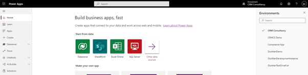
STEP 1 – First you want to navigate to the Office 365 Power App centre where you can view, edit, and create Apps. https://make.powerapps.com/
STEP 2 – Check the environment you are currently in using the Environment Selector in the top right corner of the window. (Often it will pre-select the “Default” one which you don’t want). Select the environment you wish to build the Power App in (if you are testing something choose your Sandbox/Development one).
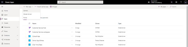
STEP 3 – Once you are in the correct Environment select Apps from the left navigation bar which will load you to a list of app Canvas and Model Driven Apps within this Environment. Select New app on the top bar and then Canvas.
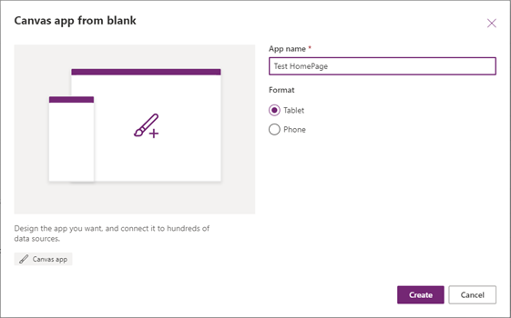
STEP 4 – Provide an App name (something unique that will be easy to locate as this is the name which will be displayed on the previous screen). Then select a Format, if this is a Mobile Phone only App then select Phone other leave it selected on Tablet. Then select Create.
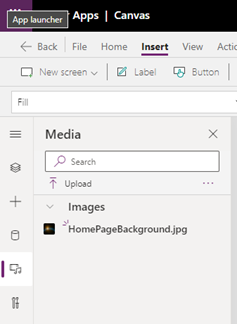
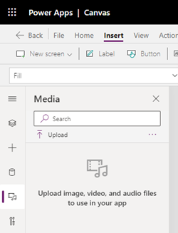
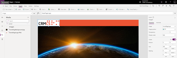
STEP 5 – Adding a background can be done by first uploading an image file to the Media section on the far-left navigation pane then clicking upload and selecting the file from your File Explorer. Once uploaded it will be visible in the Media section where you can then drag and drop it onto the page.
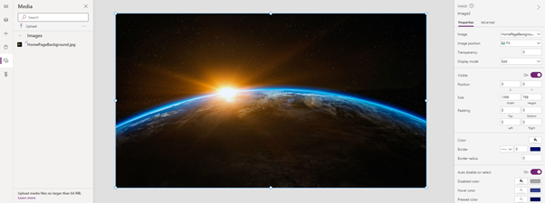
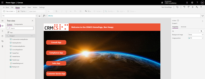
Once on the page you may need to reposition the image by clicking and dragging the corners and modifying the Image Position option on the far-right side until you fill the page like the below.
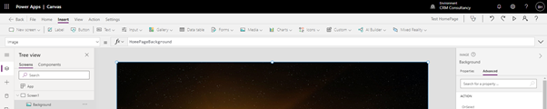
As you add new components to the page you will see that they are added into the Tree view section on the far left navigation pane. I would recommend rename these as they are added otherwise it can become very difficult to navigate in this page once more Components are added. To rename them select the … and select rename.
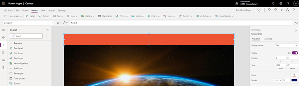
STEP 6 – Adding a heading bar requires multiple components depending on your requirements. In this example I will add a shape at the top with the logo and some Dynamics text welcoming the User. First let’s start with the shape, to add this click the + on the far left navigation bar then select rectangle, then drag the rectangle to the require location and resize it to your requirements. Once in the correct position you may then want to modify the colour of the shape by using the Colour option on the far-right navigation bar.
Next, we can add the logo, to do this go back to the Media section on the far-left navigation bar (where we uploaded the background image) and select upload and locate your Logo image from the file explorer. Then drag and drop the image onto the page and resize accordingly.
Finally, we can add the text, for this I added 2 separate Text Label components from the + navigation pane on the far left.
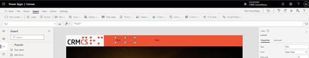
For the first Text Label double click it and add the required text, then use the far-right navigation pane to modify the text size, colour and styles.
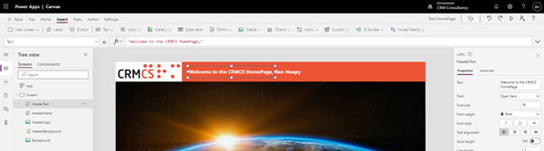
For the second Text Label single click it then go to the top navigation bar and add the following into the fx section User().FullName . If it has worked correctly, you will see the text on the page should change to match the name of the User your logged in as.
STEP 7 – Adding Buttons. To add this, click the + on the far-left navigation bar then select Button, then drag the Button to the require location and resize it to your requirements and use the navigation bar on the far right to change to colour and text etc.
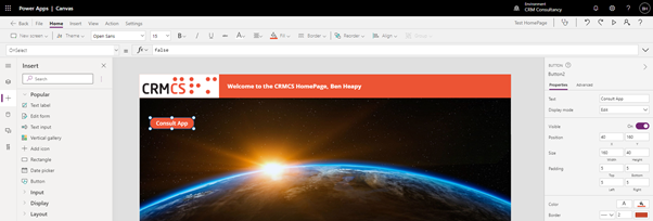
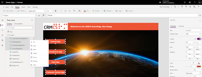
Repeat this process until you have all of the buttons you require as per the below example, or you can copy and paste your original button by selecting is and clicking CTRL C then CTRL V on your keyboard.
Once you have all your buttons, I would recommend Grouping them to make it easier to work with them in the future. To do this select each button from the Tree view on the far-left navigation bar whilst holding CTRL on your keyboard then click the … on any of the buttons and select Group.
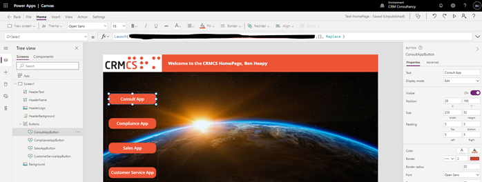
STEP 8 – Adding Redirects or links to your Buttons. Firstly, acquire the URL’s you wish for the button to go to when being clicked. Once you have to URL select to button on your page then in the fx bar on the top navigation check the dropdown is set to OnSelect then in the bar remove False and type Launch(“YOURURLHERE“) and hit enter (note if anything is wrong a red x will appear next to the button and you will need to check the text entered in the fx box.

Note: By default this will open a new tab in the browser, however if you would prefer you can set it to just use the current page by adding ,{}, Replace to the end of the text so it would look like Launch(“YOURURLHERE“,{}, Replace)
Repeat this same process on each button.
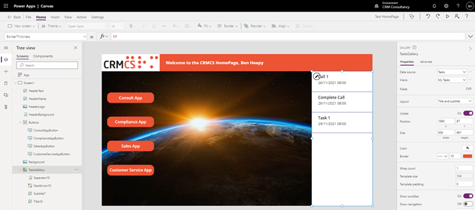
STEP 9 – Adding a Gallery to show records from Power Apps. You may wish to show a list of Tasks/Activities the User has for that day and this can be done by adding a Gallery. To add a Gallery, select the + on the far-left navigation bar and select Vertical Gallery, then select the data source you wish to link this too (in my example I am linking it to the Activities Table within PowerApps.
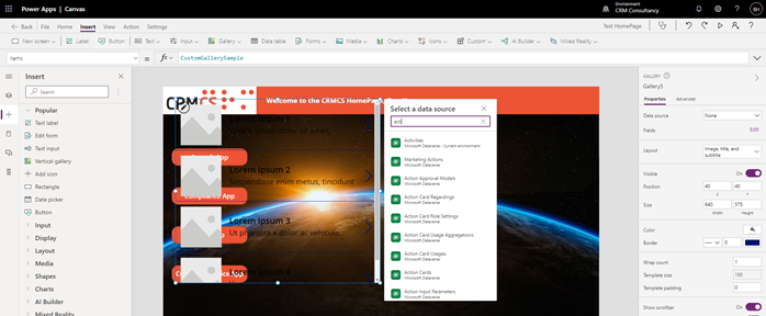
Once the data source has been selected you will then need to select the filter/view for the data over on the far-right navigation pane using the View dropdown option. Then you can use the same navigation pane and then set the required layout which will allow you to choose how much data is shown (e.g. number of columns). Finally, you can then use the same pane to change the colour, boarder etc.
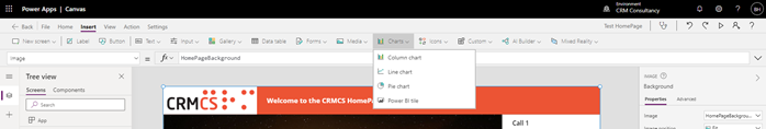
STEP 10 – Adding a Power BI Report. You may wish to add a pre-build Power BI Report which will provide the User with details on targets etc. To do this select Insert on the top bar and then select Charts then Power BI Tile.
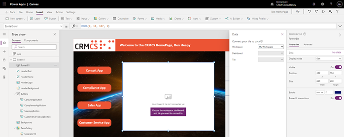
Once the tile appears on the screen you will then need to select the Workspace, Dashboard and Tile you wish to display on the screen.
Note: All User will require a Power BI licence and for the Dashboard to be shared with them to view it in the Canvas App.
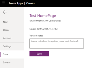
STEP 11 – Saving and Publishing the App. The final step is to Save and Publish to app to make it accessible to Users, to do this click on File on the top bar then Save
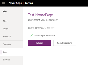
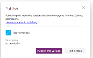
Once saved you should then see a Publish button appear, select this then select Publish This Version
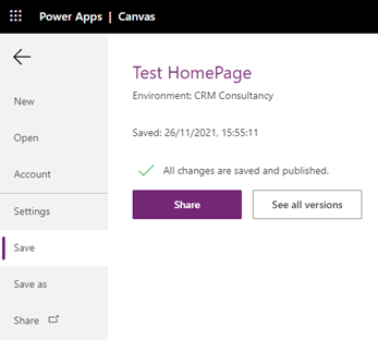
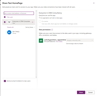
Finally, you will need to Share the app with Users you wish to have access, to do this select the Share button on the far-left navigation pane below Save As. This will open a new tab with a section on the far right (like below screenshot). Within this section you will need to type the name of the Users you wish to have access to the App and then select Share in the bottom right.
Note: If you want to share it with all Users you can search for Everyone.
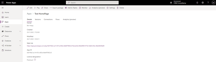
STEP 12 – Provide Canvas App URL to Users. If you chose not to send Users an invitation in the previous stage, you may watch to provide a URL. This can be location on the screen behind the Share screen done in the previous stage under Web link.
Further Reading:
For more HOW TO and Technical Articles visit: https://www.crmcs.co.uk/blog/blog.aspx


